Jonathan Barnbrook
Jonathan Barnbrook is a British graphic designer, filmmaker, and type designer best known for his socially conscious work and dramatic visual style. Born in Luton, U.K. in 1966, Barnbrook studied at Central Saint Martin’s School of Art, and the Royal College of Art (RCA). Barnbrook got into design early in life, around age 15-16, because he was interested in band logos and the letterforms that created them. He said in an Eye Magazine interview “I was drawn to the associations with pop groups, the romance of the relationship between music, the typography and the images” (Poynor, 1994, para. 4). This fascination in letterform design led him to design school, and eventually to collaborations with some of the most influential creative minds of the 21st century.
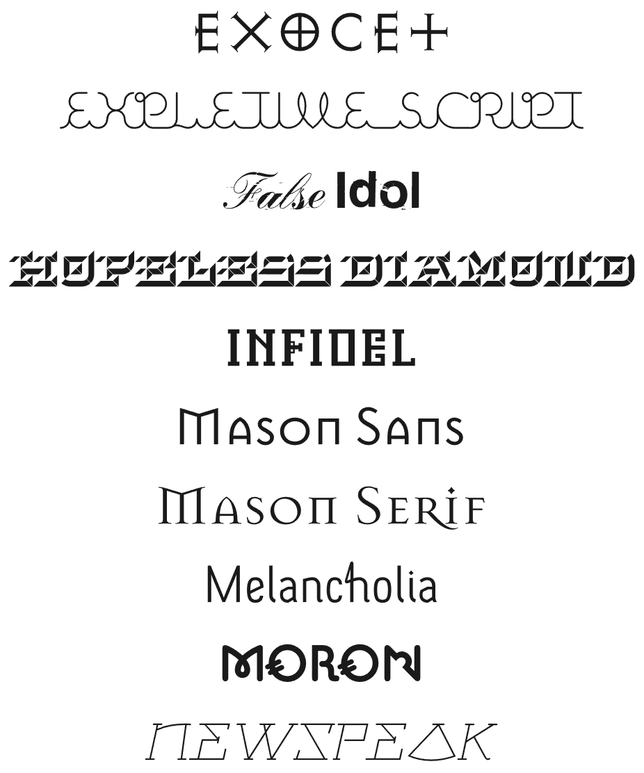
Even before graduating the Royal College of Art, Barnbrook was making a name for himself internationally, having his work published in major magazines in Europe, the U.S., and Japan (Esposito, 2021, para. 1). This only happened because Barnbrook was working at Why Not Associates while an RCA student after David Ellis, the founder of Why Not Associates, saw Barnbrook’s work at Central Saint Martins and met him as Ellis was also a tutor at RCA (Poynor, 1994, para. 24). After graduating Barnbrook opened his own studio in 1990, and by 1997 launched his own type foundry, Virus Studio. The foundry was where he released numerous typefaces such as Exocet and Mason, and where he published a catalogue called VirusFonts: Font Catalogue, explaining the influences behind the letterform designs such as the rise of religious cults, and the pre-millennial Y2K apocalyptic paranoia (Barnbrook, 1997a).
Mason was a very controversial typeface when it released in the U.S due to it sharing the same name as prolific serial killer Charles Manson. This typeface, inspired by classical stone architecture, was originally named to “express extreme opposite emotions – love and hate, beauty and ugliness” by having an elegant name echoing words like mason and mansion, while also being associated with something so horrific and vile as the Manson cult and murders (Barnbrook, n.d-a). This typeface became one of Barnbrook’s most popular, with clients like Walt Disney and the BBC using it, and it was one of the first typefaces ever to be included in the permanent library at the Museum of Modern Art in New York (Barnbrook, 2011, para. 1).
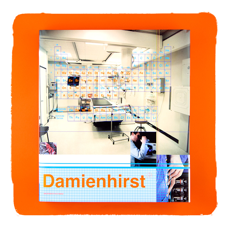
Beyond the numerous collaborations with Hirst, Barnbrook has worked on book designs for many creative people from visual artists to models, photographers, musicians, and megastar celebrities like Rihanna and David Bowie, the latter of which he had a close friendship with and collaborated with numerous times until Bowie’s death in 2016. He first worked with Bowie in 2002 to design Bowie’s Heathen album, then again in 2003 for Reality, 2013 for The Next Day, and 2016 for Blackstar, Bowie’s final album. Barnbrook’s work with Bowie is some of his most well known and respected, with his Blackstar design winning numerous awards including a Grammy award in 2017 for Best Recording Package (Barnbrook, 2016, para 2.).
Barnbrook's Influence
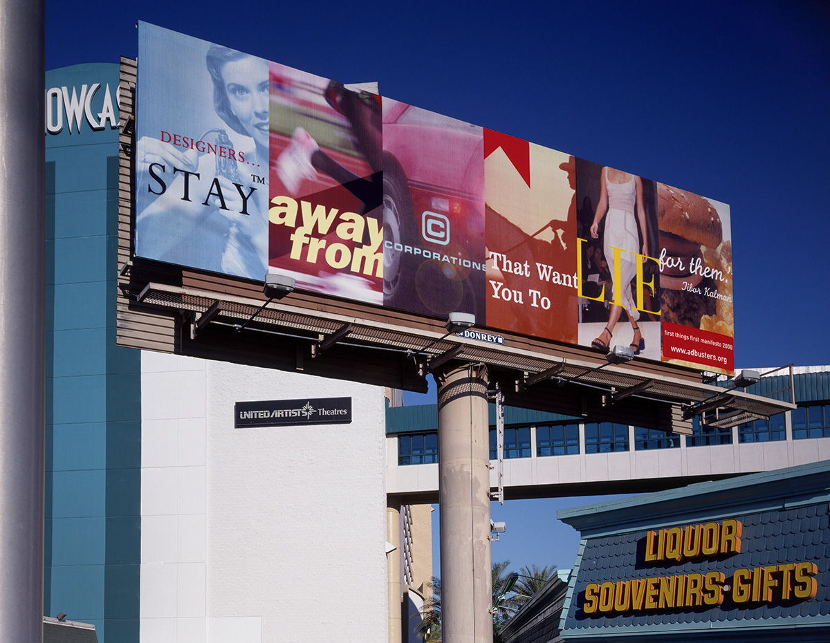
What makes Barnbrook so influential is that he approaches design more like art, his goal is not just to communicate but to evoke an emotional response and deeper thought from the viewer. His ability to combine strong visual language with far reaching conceptual ideas, critiquing many aspects of modern life, makes him stand out from so many designers that play it safe for fear of losing clients and money. Barnbrook event went as far as designing a billboard stating “Designers, stay away from corporations that want you to lie for them”, and displaying it prominently in Las Vegas during the 2001 American Institute of Graphic Arts (AIGA) conference in Las Vegas (Esposito, 2021, para. 6).
His work pulls inspiration from cultural, political, socio-economical, and emotional contexts related to the project he is working on and the things that inspired it. Unlike many designers that aim to please corporations and get mass market appeal to make lots of money, Barnbrook creates work that pushes viewers to think about real issues in the world that many don’t want to acknowledge. His designs are bold, often opinionated, and multi-dimensional in their meaning, qualities that enabled him to standout and build connections with others that further entrenched his credibility and influence in the design world. Barnbrook has even said “You cant just put work out there and let that be the end of it. If you are interested and you want your job to have some worth to society, you need to have a bit of courage and question these things.” when speaking about the politics of design in a 2016 interview (Gosling, 2016, para. 5.)
This belief is evident in Barnbrook’s typeface design and names, which often are strongly influenced by issues like war, consumerism, and government corruption. For example his Newspeak typeface uses forms inspired by Stalin era Russian architecture, while the name is inspired by George Orwell’s 1984 novel about totalitarian government control. Exocet’s forms are inspired from primitive Greek and Roman stone carvings, but it’s named after a French anti-ship missile as Barnbrook wanted to show “the danger of language – the possibility to soothe or vilify with words, to start war or create peace. It hints at the violence possible with a simple rearrangement of the alphabet (Barnbrook, n.d-b, para 2.). His approach to typography really pushes the boundaries of what a designer can do in their domain, and shows how innovative and interesting type can be.
Barnbrook's Contributions
Barnbrook’s use of expressive design to highlight major socio-cultural issues is part of an ongoing movement of designers using their skillsets for more than corporate benefit. He was one of the early designers who was conscious of issues like environmental destruction for corporate benefits, and he wasn’t afraid to give a middle finger to these brands through his work (remember the Vegas billboard?). He lead the reissue of the First Things First manifesto in 2000 (the original was 1964) while working at Canadian non-profit publication Adbusters, as part of his mission to create more social awareness of over consumption through design, and got 33 leading visual communicators to sign on (Emigre, n.d.).
Barnbrook was also asked to design the Occupy London logo, as part of the larger global Occupy Movement that started with Occupy Wall Street in New York. While this was an unusual request he jumped at the opportunity, incorporating an O as a bullseye and an L to make the head of an arrow (Barnbrook, 2012a). Several other designers were asked as well, and after a public vote Barnbrook’s design won and was used extensively. Barnbrook is a master of connecting design language with greater social commentaries, and is helping pave the way for other designers to use their voice and be more politically engaged.
Type Analysis - Mason Serif
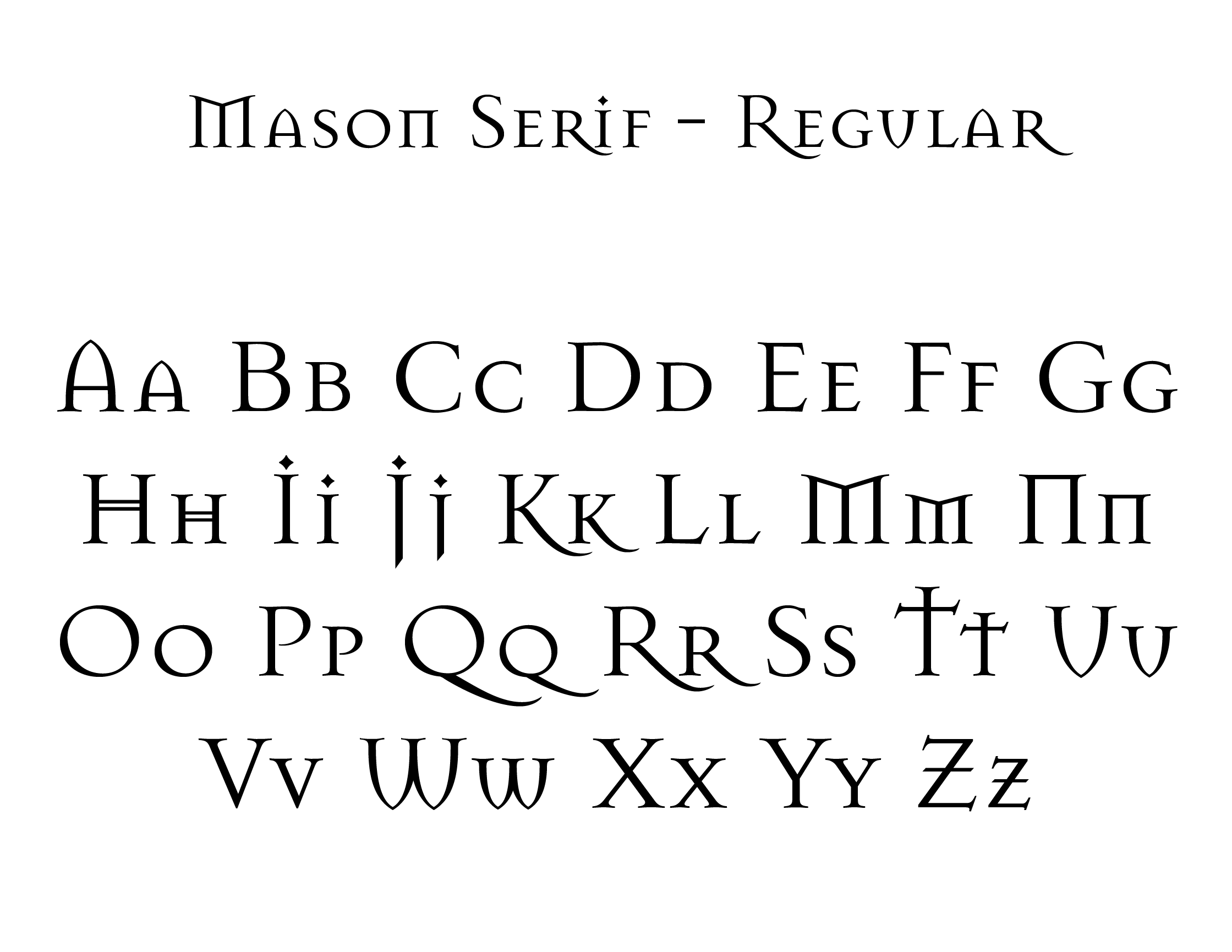
I chose to analyze this typeface because I really enjoy the look of it, and it was almost the winner for my logo design projects wordmark typeface last semester. Mason Serif is an architecturally inspired serif font with old style typeface influences. It uses stroke weight variation, has a diagonal stress axis, and uses bracketed serifs just like old style typefaces. It’s important to note this is a display font with no proper lower case characters, the only options are uppercase letters and small capitals. It only has a Roman stance.
Composition Analysis
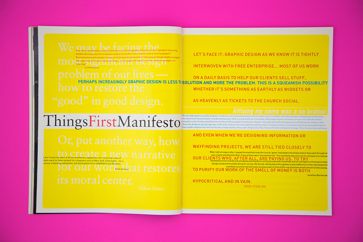
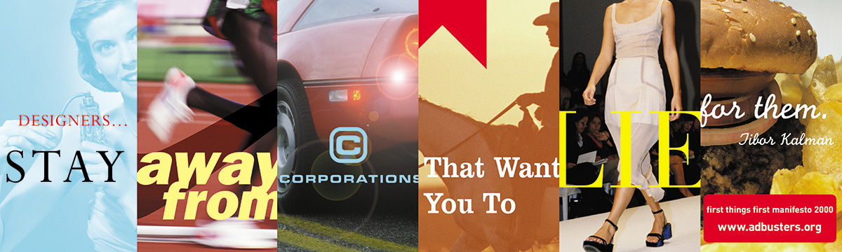
I chose to analyze one of the pages of an Adbusters publication Barnbrook worked on, because there is so much going on in this layout it’s kind of overwhelming at first to look at. This is a 2 page spread that brings attention to the First Things First manifesto relaunch that Barnbrook was spearheading in 2000. It’s about the ethics of designing with corporate interests at the forefront, and trying to be more conscious of socio-economic issues.
First the colour choice is a neon lemon yellow, a colour so bring you might not want to look at it. This type of yellow is often used as a warning or caution sign colour in street signs and on health and safety packaging to act as a “HEED WITH CAUTION” signifier.
Your eye immediately gets pulled to the “Things First Manifesto” (the ‘First’ first is on the page before it) due to the large size and perceived white space around it. It’s not actually white space but the contrast between the white text on yellow is so poor it may as well be. The red colour of the word “first” makes it read as First Things First Manifesto, as my eye read that word right away and then again in the correct sequence. It uses an Old Style type for this phrase, giving it more authority and formality than all the other type in the layout which is mostly sans-serif. It feels important, like the heading of a significant legal document.
The darker teal colour pulls the eye as the 2nd focal point, because it starts on the left where the barely readable large white-on-yellow type is, so it has little competition for attention. Even on the right ride against the red text wall, there is only 1 line of text in that darker teal colour, giving enough contrast in colour to stand out and pull the eye to it. It uses a slightly heavier font weight making it feel more important too. It’s provocative and draws the reader in by calling out the very profession that made this layout. At this point I am interested in exploring the rest of the text on the page, even when it is hard to read like the white type on lemon yellow background.
The 3rd area of focus is the wall of red text on the right page. This is the last chunk of easily readable text, and even it is a little difficult to read at the end due to the proximity of the black small text cluttering the space around it. Here the reader may notice these are quotes from professionals working in visual communication.
Due to its proximity your eye will likely read the small black type clustered into the bottom right of the layout, and then the opposite text on the left side which is the same colour, weight, size, and stance. These focal points are essentially pulling your eye around the layout in a clockwise fashion until you get to the very last section of text, which breaks this pattern. I perceive this to be a subtle message of “tick tock, we need to get moving with this to enact change if we want anything meaningful to happen”. That may not be obvious to a lot of viewers, but I perceive it that way because after doing this research project I’ve seen how many layers of meaning Barnbrook likes to add into his work.
Next up your eye will likely go to the top left red text, which is hard to read in this image but up close would likely be more readable. The red type has less contrast than the black so it recedes into the background more. After this your eye will likely go to the much smaller teal on white section, which doesn’t feel very readable due to it’s full page line length and very small font size. The larger white on yellow “Affixing my name was a no brainer” is the next thing to notice because while it is the largest text on this page, the contrast is so poor it’s easy to overlook until you’re reading the small teal text right beneath it.
Lastly the large white text on yellow, on the left side, is where the viewers eye likely ends. The message here is intentionally fading into the background, I believe to signify that morals and ethics about design are often overlooked when dealing with corporate clients who typically value profits over everything else, and push designers to do whatever they can to increase consumerism.